Rethinking the Lloyds Bank remortgage application.

Users were responding negatively to the outdated, form-based application. Likewise, the homepage had too much emphasis on the process of applying, suggesting that it was difficult to work through. So we:
Redesigned the homepage, focusing more on the benefits of applying, as well as Lloyds as a brand.
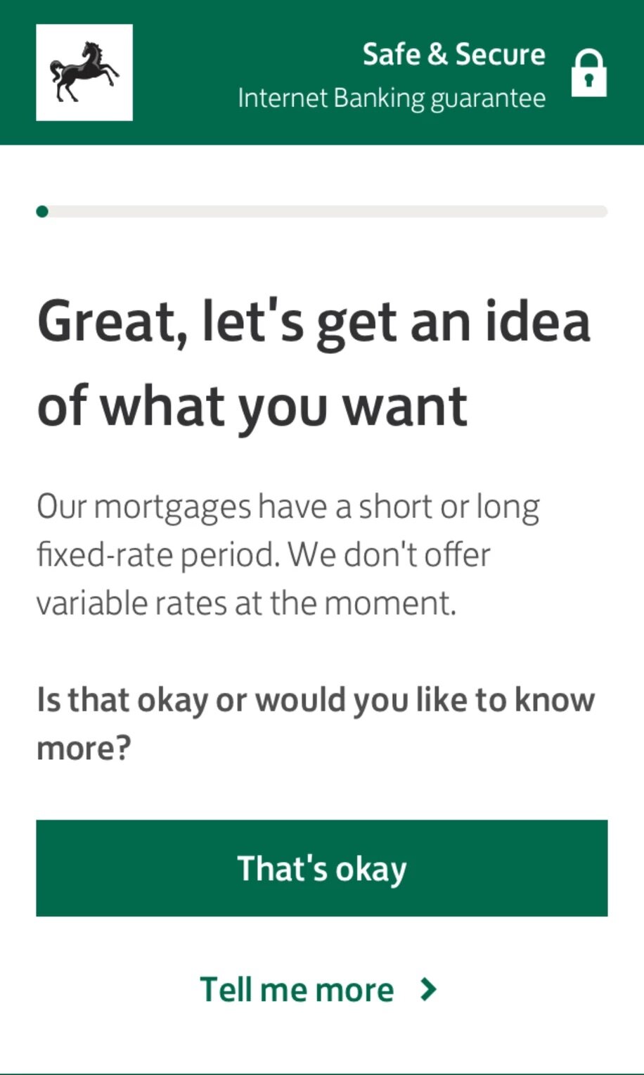
Redesigned the application to be more modern and intuitive:
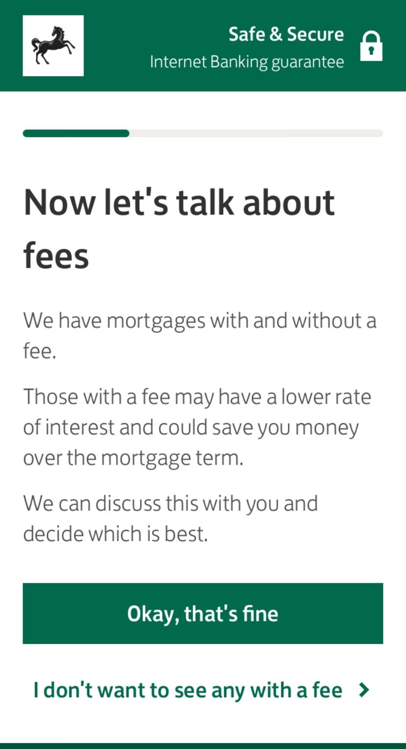
using one question per screen, giving a sense of journey and progress, as well as simplicity
simplifying questions and eliminating jargon so users get things right, first time
mirroring the flow and language of a face-to-face meeting with a mortgage adviser
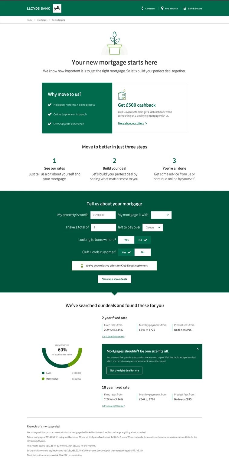
We ran an AB test which showed 53% uplift from the homepage to the mortgage calculator; 225% uplift from the homepage to the Agreement in Principle; 147% uplift from the mortgage calculator to the Agreement in Principle.
Mirroring the conversation: We shadowed mortgage advisers in a Lloyds branch, studying the conversations they had with customers. This meant we could mirror the flow and language of a face-to-face meeting.
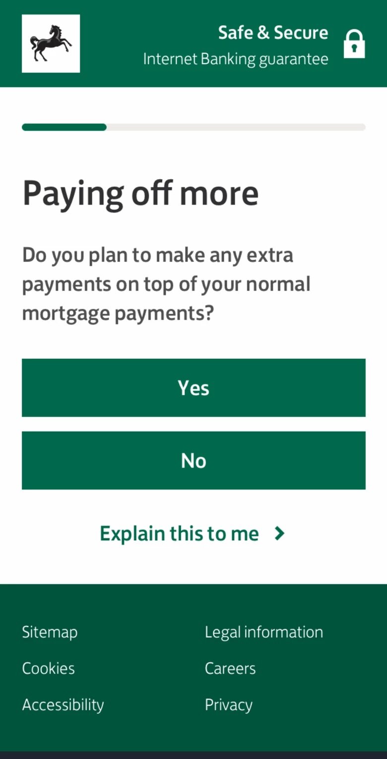
Simplifying language: Research showed that many people didn't understand the term 'overpayment'. So, along with a handful of other bankisms, we made the decision to remove it. Users responded positively: 'paying off more' was far clearer.
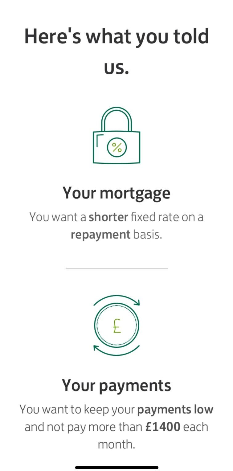
Confidence to continue: Playing back what a user had told us, clearly and concisely, was key for them to be able to continue online without the help of a mortgage adviser.
Giving choice: It was important to let users direct the flow of conversation. For example, being able to ask us to explain something they didn't understand. Or to quickly remove certain mortgage features they weren't interested in.